New UI, same old us
They're here! It feels like the holidays around December time, when you were a kid, and you'd rush downstairs to open your new toys.
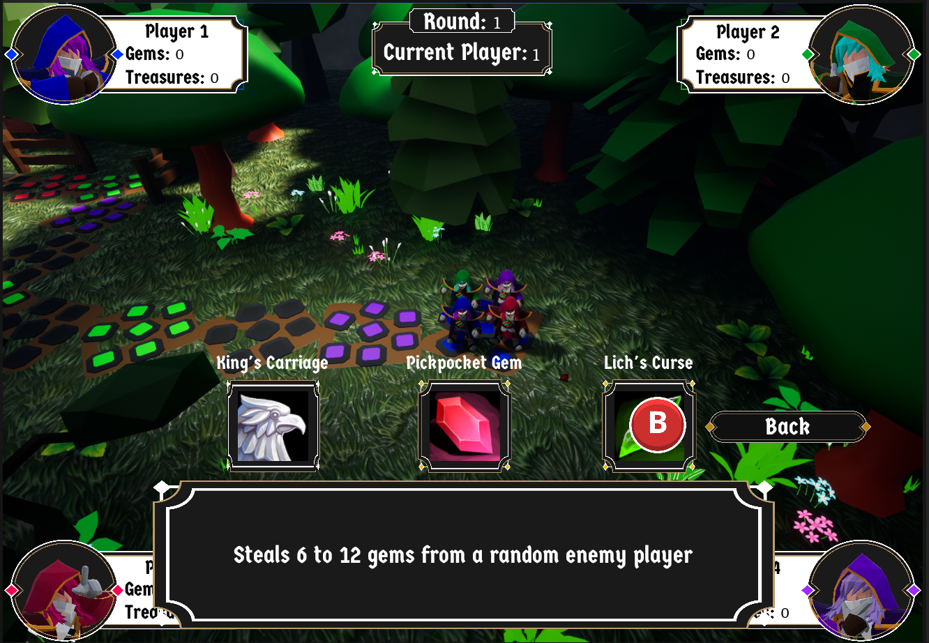
With a special thank you to our UI designer, we have new assets to put in the game. Here's a showcase of a few screens that can show the most:

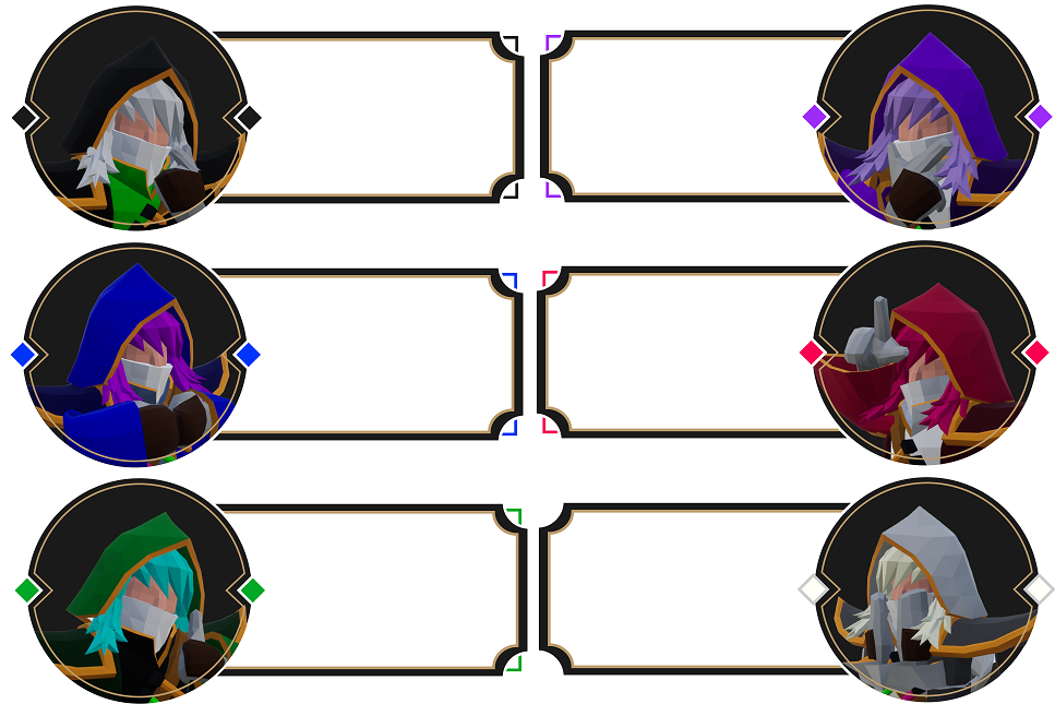
Here's our main UI. Here is showcased all our mage icons (also pictured in full below) and our main message box. We wanted something that gives off the feeling of fantasy elements, but also keeping them sleek.

^ I wanted to give each character a bit of personality with unique poses for each

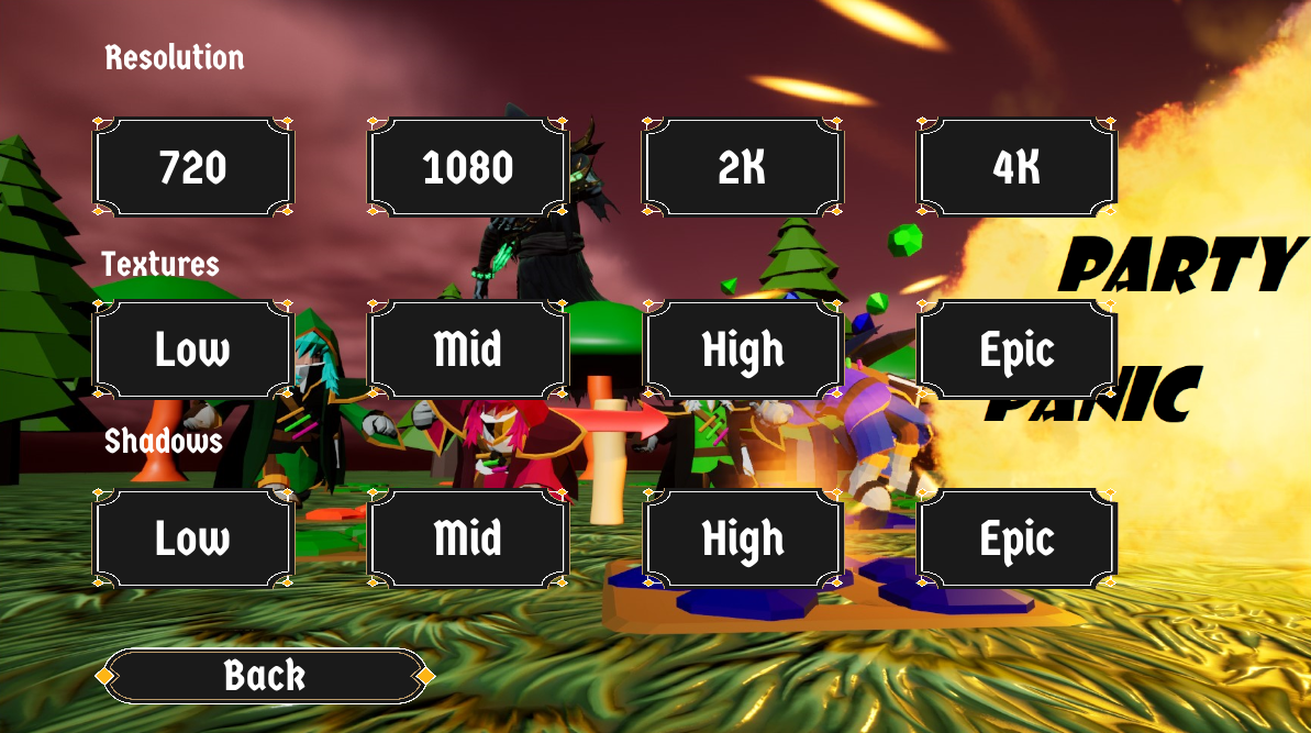
Here's a better look at how the rest of our UI assets look. Because I can't post ALL the UI screens, I feel that this many would help give the vibe of how they look for the rest of the game.
To talk about some troubles I had with our new assets: we had to remake them almost from scratch because of some resolution issues. Turns out, when we started, I did not provide the correct resolution, so the assets started out as really really tiny and looked terrible when scaled up. Thankfully, that got resolved.
I hope you enjoy these new assets as much as I do. We worked hard on them!
Thanks for reading,
- Marcos "El Macho" Camacho
Get Party Panic!
Party Panic!
Race against your friends for the treasure in this 4-player party board game!
| Status | Released |
| Author | ctrl.alt.defeat.team |
| Genre | Adventure |
| Tags | Board Game, minigames, Multiplayer, party-game |
| Languages | English |
More posts
- Game Over! Continue?Jun 24, 2023
- Reflecting on the Journey: The Finale of Party Panic's Development... or IS it?Jun 22, 2023
- Animating A Mesh Without a Skeleton by WhitakerJun 16, 2023
- Animating Text in a Widget By WhitakerJun 16, 2023
- Final Stages and Future Prospects: Party Panic DevlogJun 15, 2023
- The Volcano is active!Jun 10, 2023
- Devlog: Conquering the Challenges in 'Crash'em Karts' - New Kart Racing Mini-gam...Jun 09, 2023
- Camera Angles and using new CamerasJun 08, 2023
- Party Panic! Devlog: Navigating through Challenges and Revving Up for a New Mini...Jun 02, 2023
