What do "UI" see?
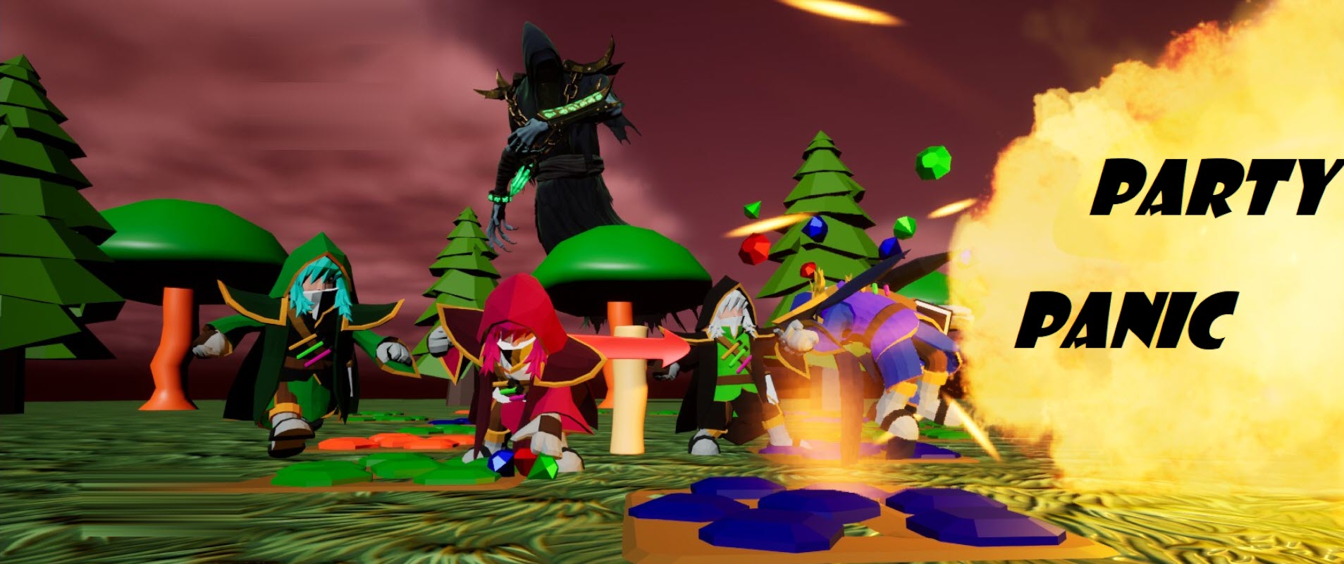
Hello Party Panic! enjoyers! We're here live to you today from the Forest Board, a very popular place downtown where Wizards and Liches alike come together to have a good time. Although weirdly enough, you can only walk in one direction and there's only one store... Well, anyways, the night is bustling. Let's have a talk with a local and see what they think.
Interviewer: Hello! How's your night going?
Mage #1: Hey guy! It's going great, yeah thanks for asking. I'm on my way to get a Link Tonic, don't tell my wife, with a buddy of mine but I seem to have lost him a couple steps ago.
Interviewer: Hey no worries, I understand. Just one Link Tonic for me and I'm DONE for the night!
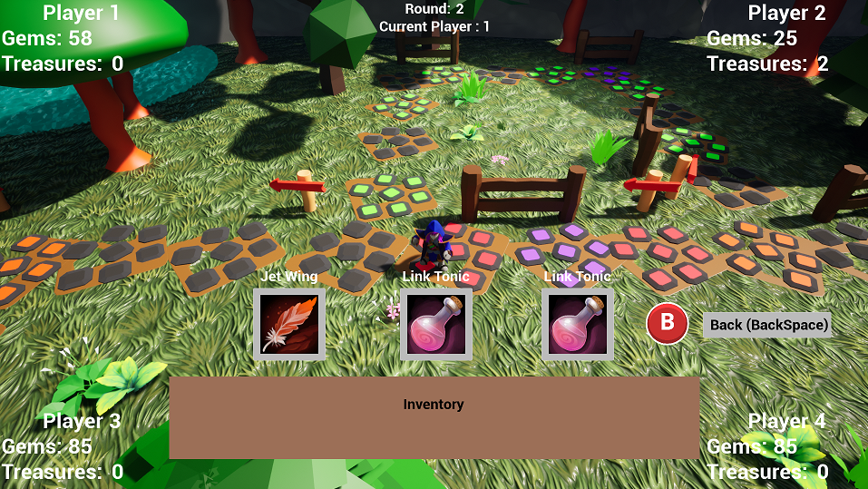
Mage #1: Hahaha yeah man, you get it. Speaking of which, I wish I could more easily tell how many Gems I have in my wallet. This UI really sucks at... being a UI. It's very ugly. But apart from that yeah I- Oh, my dice is here. I gotta go man, see ya around!
Interviewer: Alrighty man I'll see ya around have a good one!
Well there ya have it, Link Tonics stay a fan favorite and- Wait, what's this?? Oh no Mage #1 landed on a Tornado Tile! Everybody run! [Several minutes pass and the wind has died down] ...Phew, glad that's over. I wonder why Whitaker wanted to implement these Tornado tiles, maybe he wanted to torture us for fun.
Mage #1 from a very far distance: Woo!! I made it to the shop!!
Well, I'm glad he's in one piece. What was that he mentioned about the UI being ugly? [Interviewer looks up at the sky and notices how horrendous the basic UI looks] Oh jeez, someone should do something about that fast. With that, we're off to get some drinks. This has been your daily Friendly Mimic news outlet, stay tuned for next week's episode of "What are you doing with that big piece of metal?"!
----
Alright, no more virtual characters talking to each other. We have a big problem on our hands, and that's our UI. We, as game developers, have little to no artistic experience or background. That being said, we can rarely decorate our games properly, not meshes, backgrounds, and even as far as sound design. And with that being said... please be careful when looking at our horrendous UI.
Please take a moment and come back when your nausea has gone down.
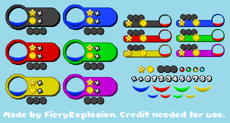
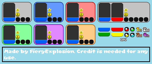
Now you know my struggle. UI is a very important part of first impression and "visual enjoyment", for lack of a better word, so I knew we needed to do something fast. That being said, we're coming up on the last month, and I decided it's time to change things. So, although I'm not an artist myself, I contacted and hired an artist friend to help us out. Horay! But it's ok, I did some work too. In preparation for this new phase, I compiled a list of all our UI objects and simplified them where needed via blueprints. Some of these were made when we first started the project, so they're a bit outdated. There was some work needed to be done in, including but not limited to: binding text boxes, removing unecessary events, unecessary functions, unecessary multiple UI "creates". Here's a bit of inspiration I pulled up, and how our UI will be looking like:


Hopefully we'll be seeing these UI changes by mid-July. Until then, thanks for tuning in, and I hope you're excited to play our game as much as we are.
- Marcos "El Macho" Camacho
Files
Get Party Panic!
Party Panic!
Race against your friends for the treasure in this 4-player party board game!
| Status | Released |
| Author | ctrl.alt.defeat.team |
| Genre | Adventure |
| Tags | Board Game, minigames, Multiplayer, party-game |
| Languages | English |
More posts
- Game Over! Continue?Jun 24, 2023
- Reflecting on the Journey: The Finale of Party Panic's Development... or IS it?Jun 22, 2023
- New UI, same old usJun 17, 2023
- Animating A Mesh Without a Skeleton by WhitakerJun 16, 2023
- Animating Text in a Widget By WhitakerJun 16, 2023
- Final Stages and Future Prospects: Party Panic DevlogJun 15, 2023
- The Volcano is active!Jun 10, 2023
- Devlog: Conquering the Challenges in 'Crash'em Karts' - New Kart Racing Mini-gam...Jun 09, 2023
- Camera Angles and using new CamerasJun 08, 2023
- Party Panic! Devlog: Navigating through Challenges and Revving Up for a New Mini...Jun 02, 2023
